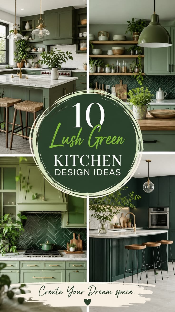
Walk into ten kitchens this year and at least three of them will have some shade of green in the cabinetry, the island, or the tile. It isn’t a passing trend anymore — it’s become one of the default alternatives to white and grey, and for good reason. Green sits closer to nature than almost any other colour a kitchen can wear, and that makes it feel calm even in a room that’s constantly in use.
But “green kitchen” is not one look. A sage green shaker cabinet reads completely differently from a deep forest island, and a lime accent wall behaves nothing like a muted olive splashback. This guide walks through the decisions that actually matter — where to place the colour, which materials it pairs with, where people tend to go wrong, and how to get the look at very different budgets.
Understanding the Green Spectrum Before You Commit
Green is one of the few colours where the undertone changes the entire personality of a room. Before picking a paint chip or a cabinet finish, it helps to think in terms of three families.
Sage and eucalyptus greens lean grey and sit quietly in a space. They work well in kitchens with limited natural light because they don’t demand attention, and they pair easily with warm wood tones.
Forest and hunter greens are saturated, almost moody. They photograph beautifully and tend to be the choice for kitchens that want to feel like a statement room rather than a neutral backdrop.
Olive and khaki greens carry a yellow undertone. They’re less common but increasingly popular in kitchens aiming for a warmer, more organic feel — closer to earth tones than to the cooler blue-greens most people picture first.
A quick test worth doing before committing: hold your shortlisted swatch next to your countertop material and your flooring, in the actual room, at both morning and evening light. Green shifts more dramatically under artificial light than most colours, and a shade that looks perfect on a paint card can turn muddy or overly minty once it’s on cabinetry under warm bulbs.
Designer Note
Undertone testing matters more with green than with almost any other kitchen colour. A sage that looks soft and neutral in a showroom can pick up a blue cast under cool LED lighting, or a slightly sickly tone under yellow incandescent bulbs. Test swatches at the times of day you actually cook.
Where to Place the Green: A Room Walkthrough
Rather than treating green as an all-or-nothing decision, it helps to walk through the kitchen zone by zone.
The island. This is the single most popular place to introduce green, and for a practical reason — it lets the rest of the kitchen stay neutral while the island becomes the visual anchor. A hunter green island against white perimeter cabinets is one of the most reliable combinations in modern kitchen design, largely because it reads as intentional rather than accidental.
Full cabinetry. Painting every cabinet the same green creates a cohesive, enveloping feel, but it’s a bigger commitment and works best in kitchens with generous natural light or high ceilings. In smaller, darker kitchens, full green cabinetry can close the room in visually unless it’s balanced with light countertops and reflective hardware.
Lower cabinets only. A common compromise: green on the base cabinets, white or light wood on the uppers. This keeps the room feeling open while still giving the colour a real presence.
Backsplash and tile. Green tile — particularly in a fluted, scalloped, or handmade zellige finish — has become one of the most requested backsplash choices in recent kitchen renovations. It’s a lower-commitment way to bring the colour in without touching cabinetry at all.
Walls only. In kitchens that are open to a dining or living space, painting just the kitchen walls green (with white or wood cabinetry) creates a subtle zoning effect without overwhelming the space.
Material Guide: What Green Actually Pairs Well With
Green kitchens live or die by their supporting materials. The colour itself is rarely the problem — the combination is.
- Brass and unlacquered brass hardware warm up sage and olive tones and prevent them from feeling cold or clinical.
- Matte black fixtures work best with deeper forest and hunter greens, adding contrast without competing for attention.
- Warm oak or walnut flooring grounds almost any green, especially the cooler sage and eucalyptus shades that can otherwise feel a little sterile.
- White or cream marble-look countertops are the safest pairing for saturated greens, giving the eye somewhere neutral to rest.
- Terracotta and clay accents pair surprisingly well with olive and khaki greens, reinforcing the earthy, organic direction.
Quick Win
If you’re not ready to commit to green cabinetry, start with hardware and a single accessory shelf in a green ceramic or glass finish. It’s a low-cost way to test whether you actually like living with the colour before repainting anything.
Lighting Advice: The Detail Most People Skip
Green kitchens are more sensitive to lighting temperature than almost any other colour scheme, and this is where a lot of otherwise well-planned kitchens go slightly wrong.
Warm white lighting (around 2700K–3000K) tends to flatter sage, olive, and forest greens, deepening them slightly and bringing out any warm undertone. Cooler lighting (4000K and above) can push green toward a colder, more clinical feel — fine for a very deep hunter green that’s meant to look dramatic, but often unflattering on lighter sage tones.
Under-cabinet lighting is worth the investment in a green kitchen specifically because it illuminates the colour from multiple angles, preventing the lower half of the room from reading as a flat block of colour once the sun goes down.
Common Mistakes Worth Avoiding
Choosing the shade from a small swatch alone. Green is one of the most sample-size-sensitive colours; a chip the size of a coin will almost always look darker or more saturated once it covers an entire wall or cabinet run.
Pairing cool sage with warm yellow-toned wood. This is a frequent mismatch that leaves a kitchen feeling slightly “off” without homeowners being able to pinpoint why. Cooler greens generally want cooler or neutral wood tones.
Overdoing the theme with green appliances, green textiles, and green walls all at once. One dominant green surface, supported by neutral materials, almost always reads better than green saturating every layer of the room.
Ignoring the ceiling and floor. A green kitchen with a stark white ceiling can feel disconnected. Even a warm off-white or a soft plaster tone on the ceiling helps the whole room feel considered rather than assembled.
Budget Picks vs. Luxury Picks
| Element | Budget-Friendly Approach | Higher-Investment Approach |
|---|---|---|
| Colour introduction | Painted MDF cabinet fronts or peel-and-stick backsplash tile | Custom cabinetry in a bespoke sage or forest lacquer |
| Hardware | Brass-finish handles from a hardware retailer | Solid unlacquered brass, aged to develop a natural patina |
| Countertop | Laminate in a marble-look pattern | Honed marble or quartzite |
| Statement piece | A single green pendant light over the island | A fully tiled green range hood surround |
Both routes can land convincingly — the difference is usually in the details, particularly hardware weight and how evenly a paint finish is applied.
A Simple Styling Formula
For anyone unsure how much green is “enough,” a formula that tends to work reliably:
- One dominant green surface (island, full cabinetry, or an accent wall).
- One warm natural material (wood, rattan, or terracotta) to soften it.
- One metallic accent (brass, black, or brushed steel) for contrast.
- One neutral, non-green textile layer (linen curtains, a jute rug, or plain tea towels) to give the eye a resting point.
Kitchens that follow roughly this ratio tend to feel styled rather than themed — the green supports the room instead of dominating every surface within it.
Maintenance Notes for Green Cabinetry and Finishes
Painted green cabinets, particularly in matte finishes, show fingerprints and grease splatter more visibly than lighter neutrals simply because of the contrast. A satin or eggshell sheen, rather than a full matte, is generally easier to wipe down around stove and sink areas without dulling the finish over time.
Green tile, especially handmade zellige, often has slight variation in glaze and colour from tile to tile — this is typically intentional and part of the appeal, not a defect, but it’s worth knowing before installation so there are no surprises.
Frequently Asked Questions
Does a green kitchen date quickly? Muted, greyed-down greens like sage tend to age more gracefully than bright, saturated shades, largely because they sit closer to a neutral on the colour wheel.
Is green too dark for a small kitchen? Not necessarily — a mid-tone sage or olive on lower cabinets only, paired with light upper cabinets and good lighting, can work in fairly compact spaces. Full dark green cabinetry is the riskier choice in a small, low-light room.
What white pairs best with green cabinets? Warm whites with a slight cream or ivory undertone generally sit better with green than stark, cool whites, which can make the green look slightly artificial by comparison.
Final Thought
Green has staying power in kitchen design because it doesn’t behave like a trend colour — it behaves like a natural material, shifting with light and pairing well with the things kitchens are already built from: wood, stone, and metal. The kitchens that get it right aren’t necessarily the boldest ones. They’re the ones where the green feels like it belongs to the room, not layered on top of it.